Zenefits UX Case Study – Comparison Tables Redesign
Redesign of Zenefits' health insurance comparison tables to improve clarity, taxonomy, and user decision-making through data-driven UX research.
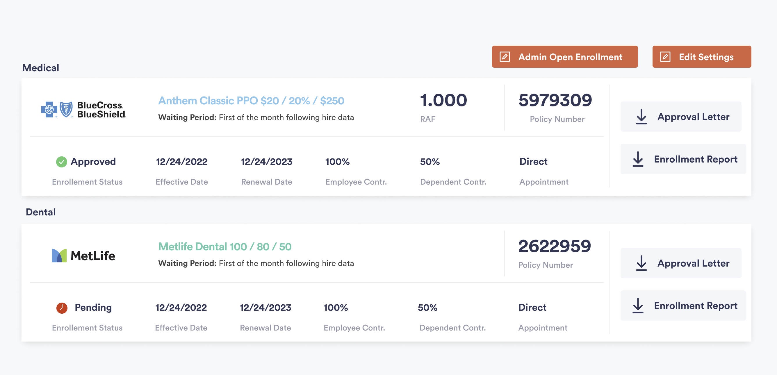
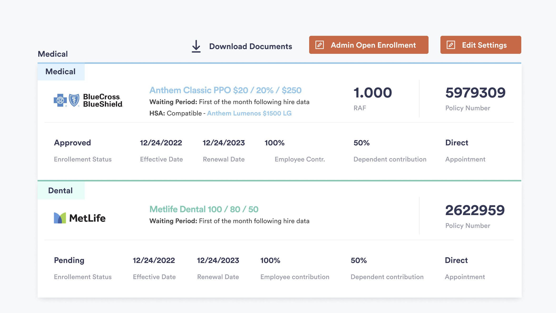
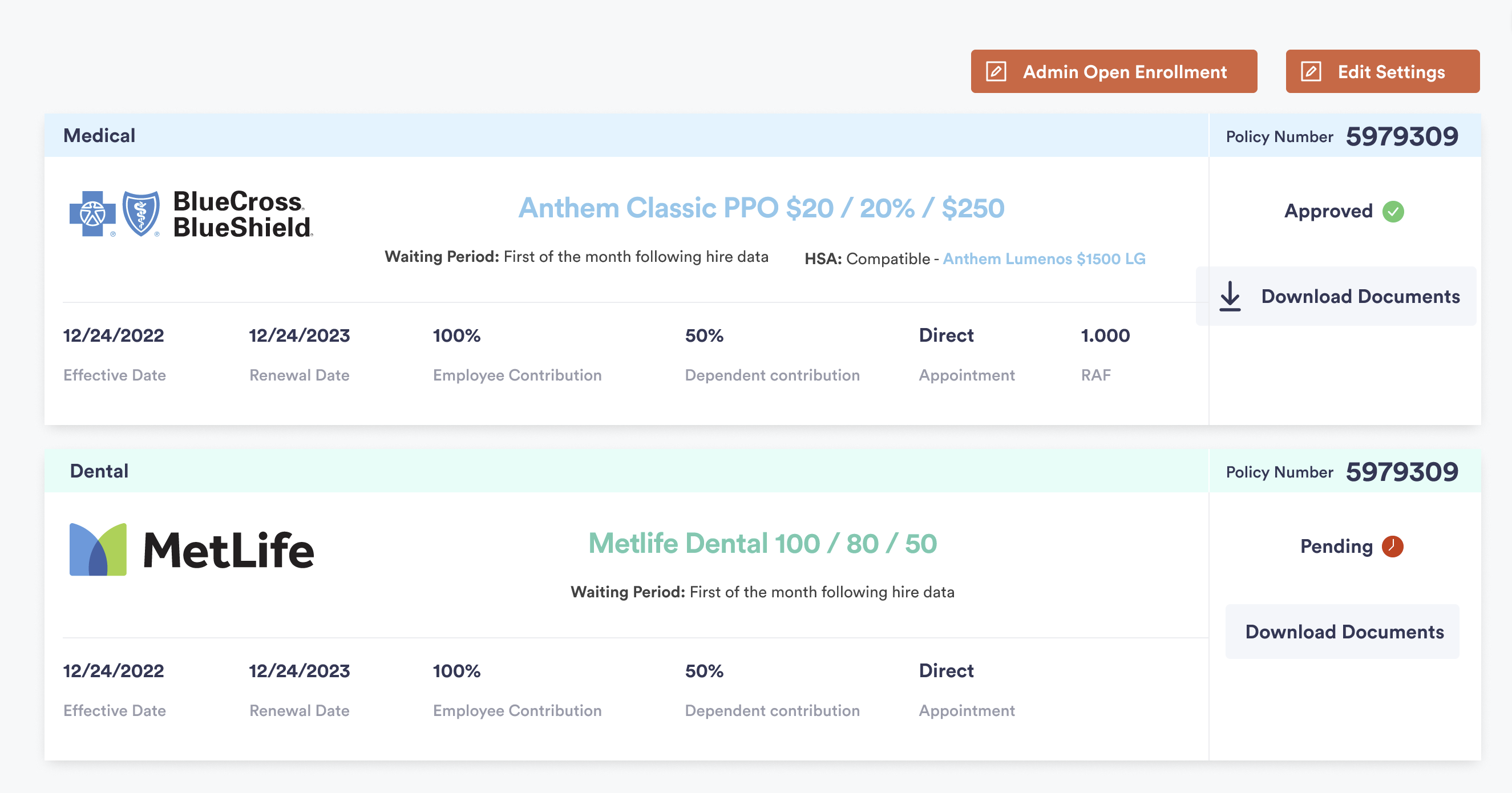
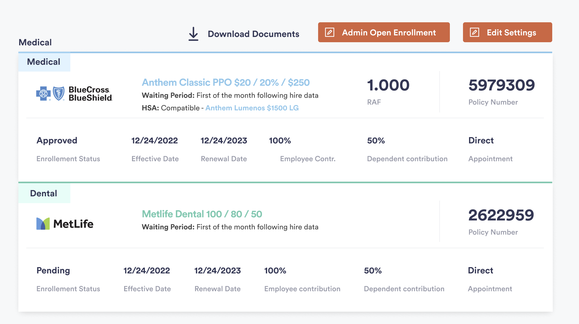
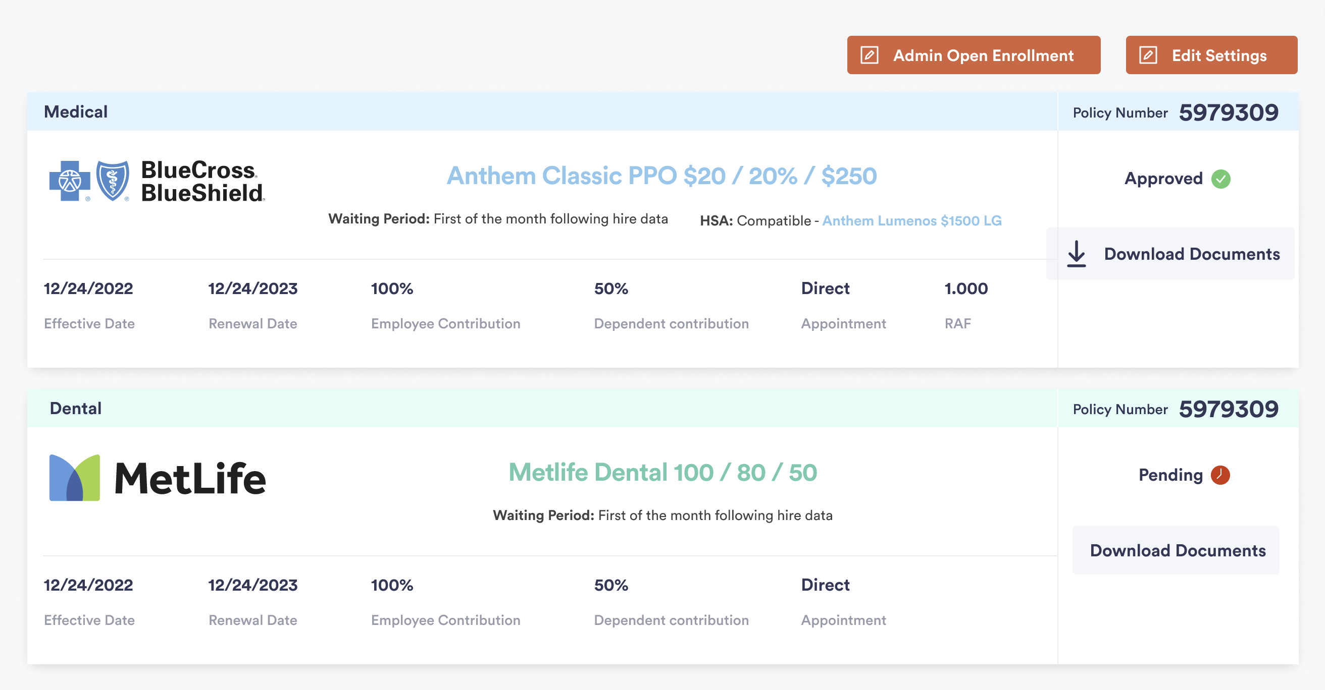
Interface Refinements
A focused look at the improved comparison table layouts, clearer visual hierarchy, and streamlined interaction patterns.
Project Overview
Zenefits—now part of TriNet—is a SaaS platform that streamlines HR, payroll, and benefits for small and mid-sized businesses. The project focused on optimizing the health insurance comparison tables, a key interface where employees evaluate plan options.
As UX Lead Designer, I led research, taxonomy creation, and UI redesign to deliver a cohesive, accessible experience aligned with Zenefits' 2023 design system.
Project Summary
Timeline & Team
4 weeks
UX Lead Designer, Product Manager, Engineering Team
Tools & Methodology
Figma, FigJam, Google Forms
User-centered design with A/B testing validation
Key Deliverables
- • Research insights
- • Information architecture
- • UI redesign
Performance Metrics
Users found design easier to read
(based on 7 remote A/B tests via Zoom)
Accurately interpreted plan details
(validated through comprehension task analysis)
Faster comprehension
(measured by average task completion time)
Problem Statement
Challenge
The existing tables had unclear hierarchy, inconsistent labels, and confusing CTAs, which limited comprehension and trust.
Main Issues:
- Unstructured data and poor semantic grouping
- Buttons not aligned with user intent
- Excessive visual noise
- Low contrast ratios
Objective: rebuild the information architecture and taxonomy to enable fast, accurate comparison of plans within Zenefits' brand guidelines.
Approach
Following a user-centered design methodology:
- User Research: 7 interviews with active and former users to understand decision criteria.
- IA Audit: Defined new taxonomy for benefits and coverage levels.
- Wireframes & Ideation: Iterated layouts in Figma and FigJam to maximize scannability.
- A/B Testing: Compared two designs with random presentation to participants.
- Validation: Feedback from usability sessions refined content structure and CTA labels.
Solution
Delivered a semantic and visual revamp that simplified data interpretation:
- Layered typography and spacing to clarify hierarchy.
- Unified CTA set ("Compare", "Select Plan").
- Contrast and color compliant with WCAG 2.1.
- Modular table system ready for reuse across other HR products.
Result: cleaner layout, consistent taxonomy, and higher perceived credibility.
Results
Quantitative testing confirmed substantial usability improvements and stronger comprehension of plan information.
Participants completed reading and decision tasks 30% faster on average, with fewer interpretation errors and greater confidence in selecting benefits.
Feedback collected through post-test surveys indicated improved readability and clearer hierarchy, aligning the redesign with Zenefits' broader UX and accessibility standards.
Key Takeaway
Clarity in structure is as impactful as visual design. By prioritizing semantic order and taxonomy, the project proved that meaningful UX decisions drive measurable business value and user confidence.