GoARIS — UX Research & Heuristic Redesign for USDA's Research Agreements Platform
UX Research, Heuristic Evaluation & Wireframing for Data Management Modernization
Heuristic Analysis & Structural Design
This phase defined RemoteVision's UX architecture through heuristics, stakeholder input, and journey mapping. The findings shaped the IA and Balsamiq wireframes refined in FigJam, producing a validated structure ready for UI implementation.
Project Overview
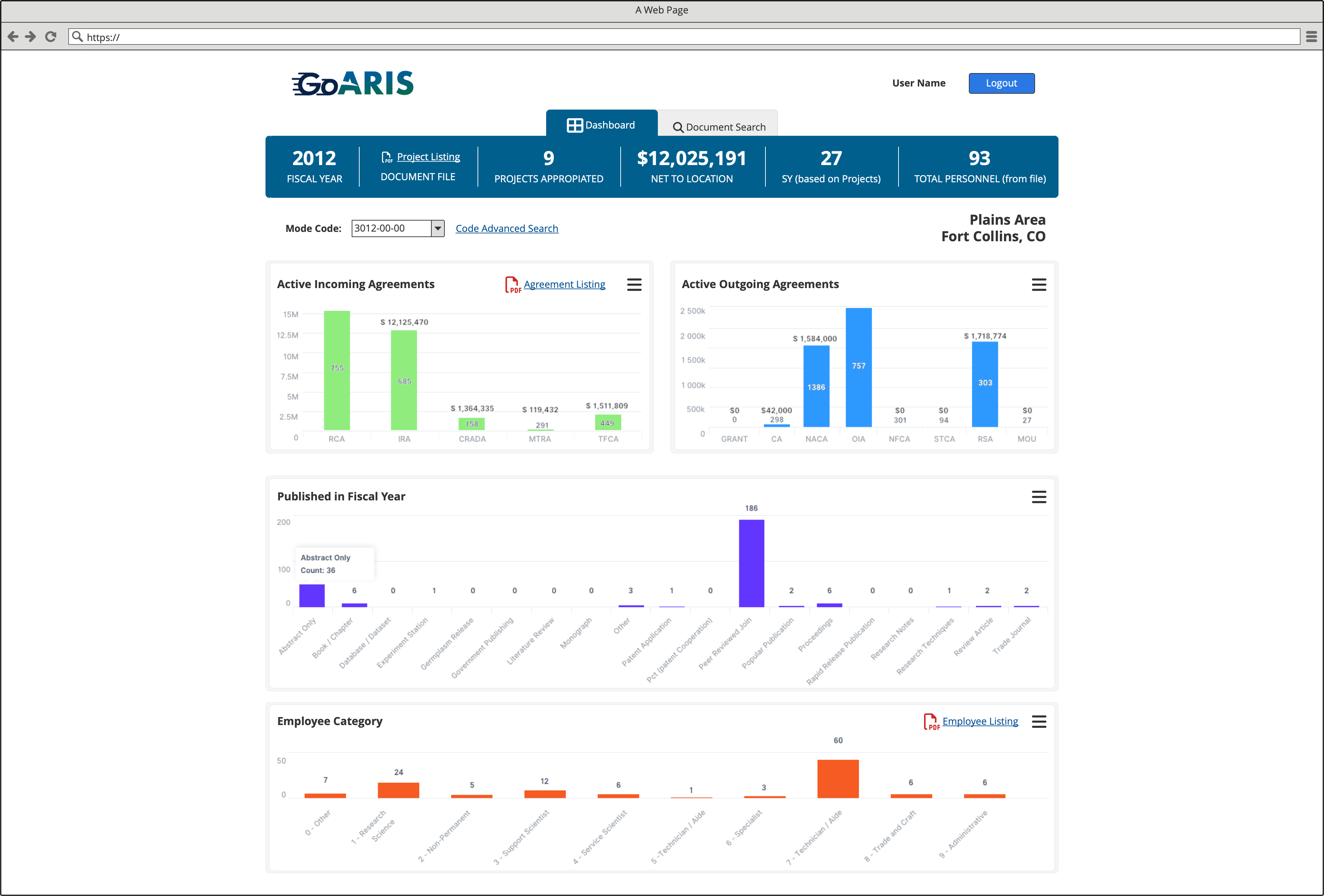
GoARIS (Agreement and Research Information System) is a web-based application used by the USDA to manage, track, and report research projects, agreements, and publications across U.S. agricultural research centers.
Originally built on an outdated framework with inefficient filters and search functions, the system needed a usability overhaul.
Working under AceInfo Solutions (now Guidehouse), I led the UX research, heuristic evaluation, and wireframing phase to define a scalable interface that would later be implemented using Angular. Although the budget excluded high-fidelity design, the wireframes served as production-ready references for developers.
Project Summary
Timeline & Team
4 months
UX Researcher & Wireframing Lead, 1 Product Owner, 2 Angular Developers, 1 QA Analyst
Tools & Methodology
Balsamiq Mockups, FigJam, Adobe Acrobat, Angular framework documentation
Heuristic evaluation, user session observation, UX audit, workflow mapping, wireframing, interactive low-fidelity prototyping
Key Deliverables
- • UX audit report
- • Workflow maps
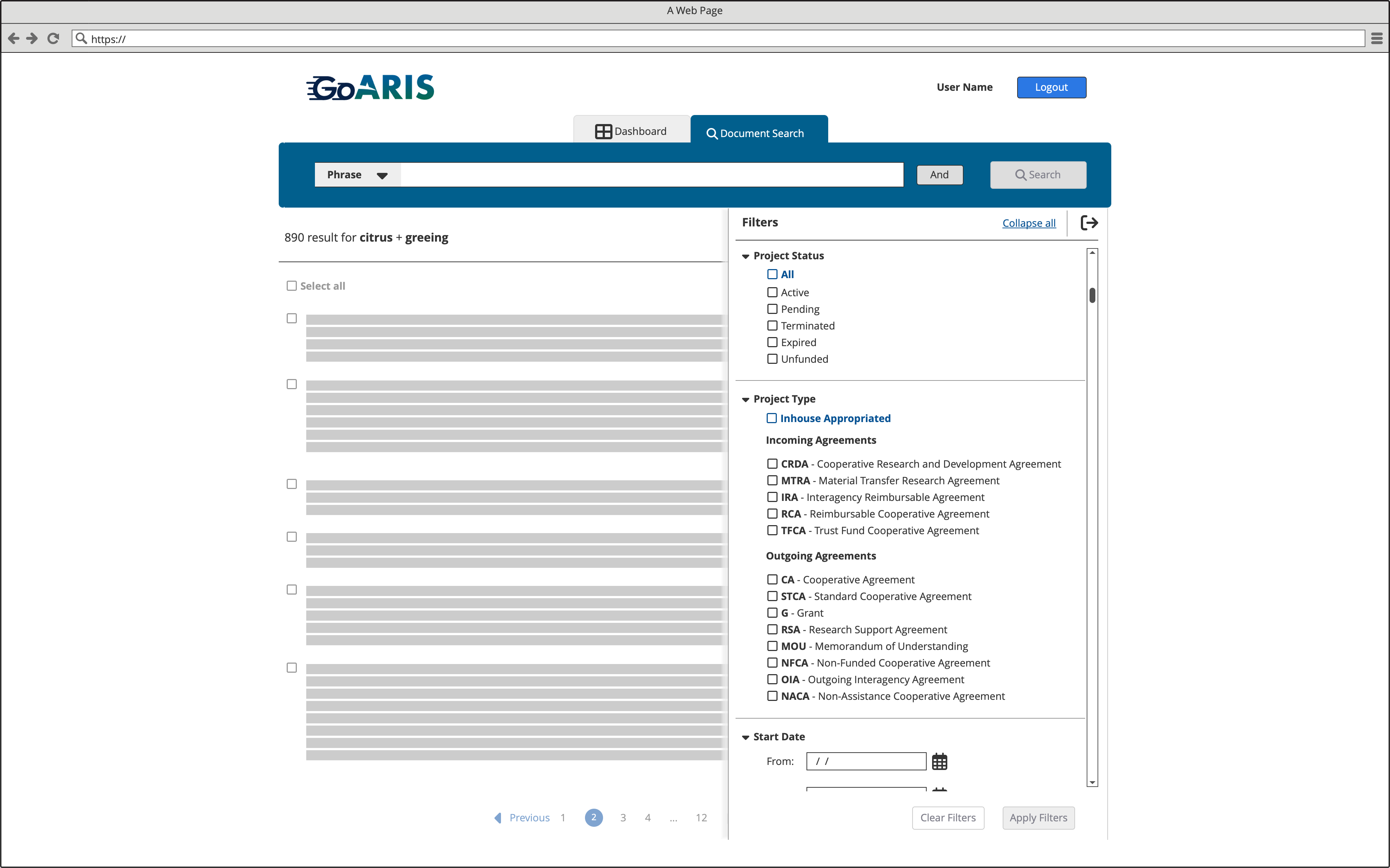
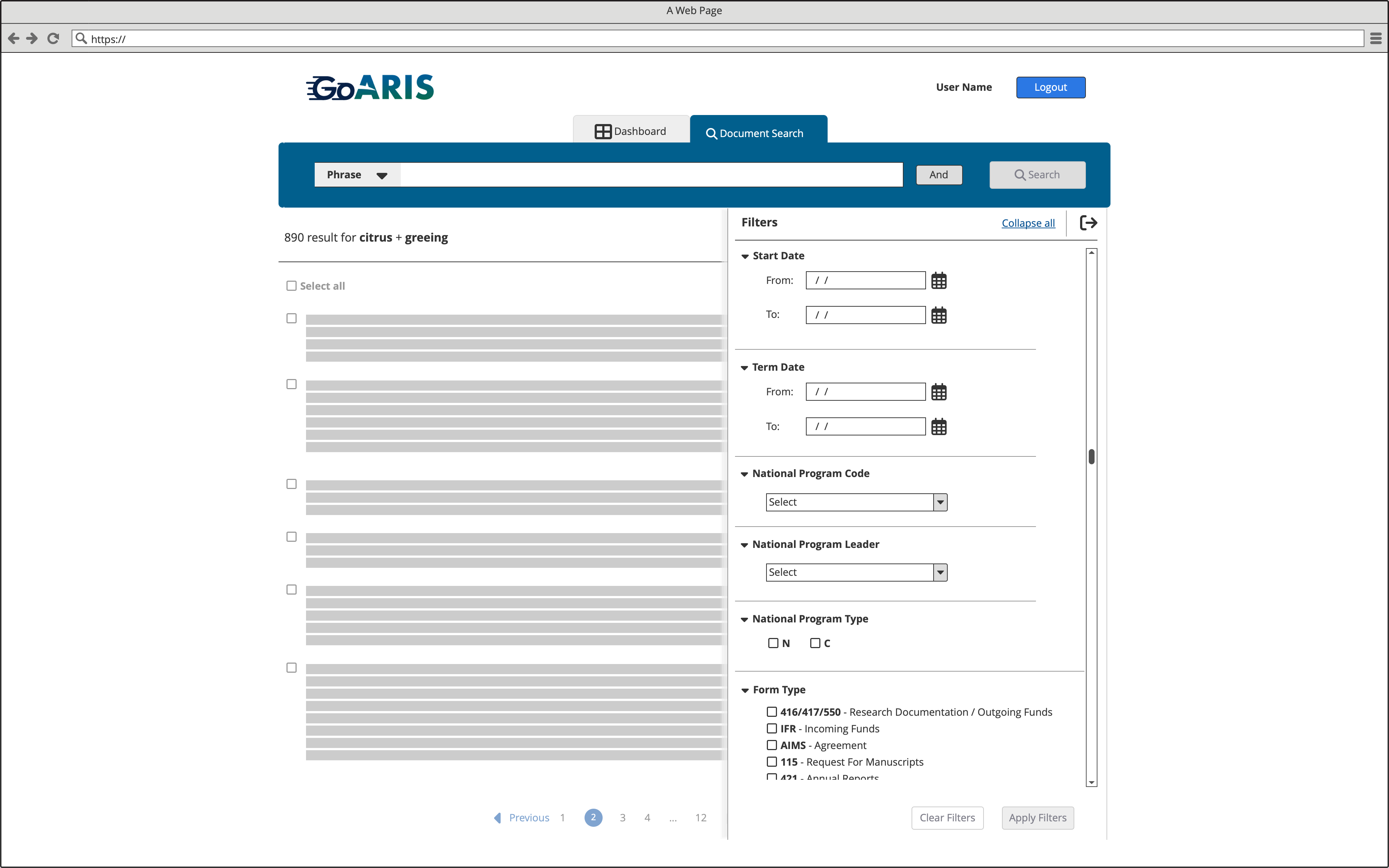
- • Simplified filtering system design
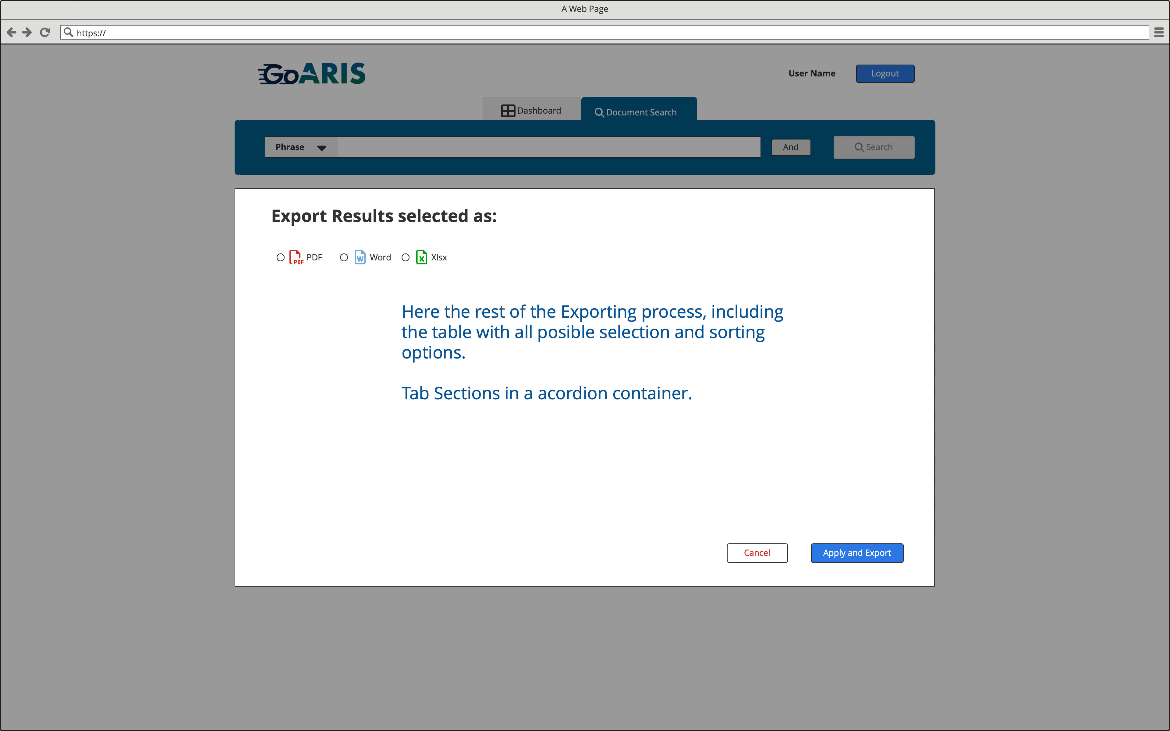
- • Interactive low-fidelity wireframes (Balsamiq Mockups and FigJam)
- • Production-ready wireframe references for Angular implementation
Performance Metrics
Completion of planned UX scope
(within timeframe and budget)
Anticipated reduction in query times
(estimated by heuristic benchmark comparison)
Adoption of new IA (Information Architecture) and workflow structure in current GoARIS releases
(validated through existing public deployment)
Problem Statement
The GoARIS platform operated on an outdated UX foundation that struggled to support the volume and complexity of federal research agreement workflows. Its information architecture lacked coherence, forcing analysts to navigate dispersed datasets with inconsistent terminology and unpredictable interaction patterns.
Content consumption was particularly problematic: documents opened inconsistently—some inside small modals, others in new tabs, new windows, or triggered downloads—leading to user confusion, loss of context, and inefficient task completion. As usage increased, these structural shortcomings created operational bottlenecks, elevated training overhead, and inconsistent task outcomes across teams.
Challenge
The legacy GoARIS system presented multiple usability challenges that hindered government analysts' ability to efficiently manage and retrieve research agreement data:
- Fragmented navigation and inconsistent terminology across the interface.
- Inefficient search and filter interactions causing user errors and frustration.
- Limited scalability and poor visibility of agreement data.
- Visual overload and lack of prioritization between datasets.
- Confusion between incoming/outgoing agreements and publication types.
Approach
Following a heuristic evaluation and user session observation:
- Conducted UX audit: Performed comprehensive heuristic evaluation of the legacy GoARIS interface to identify usability issues and pain points.
- Mapped workflows: Documented user workflows for document search, filters, and agreement management to understand current processes and identify improvement opportunities.
- Designed filtering system: Created a simplified filtering system with grouped categories (agreement types, fiscal year, employee categories) to improve data findability.
- Structured layouts: Designed new layouts emphasizing readability and visual hierarchy for financial and publication metrics.
- Introduced consistency: Established consistent label patterns and collapsible filter panels to reduce clutter and improve usability.
- Delivered wireframes: Created interactive low-fidelity wireframes in Balsamiq Mockups, enabling direct transition to Angular implementation.
Solution
The redesigned experience introduced:
- Unified dashboard: A single dashboard summarizing key metrics: active agreements, publications, and employee categories.
- Modular filters: Collapsible filters with persistent states and export-ready data functionality.
- Streamlined workflows: Improved search and export workflow, integrating PDF, Word, and Excel outputs.
- Enhanced accessibility: Improved accessibility and contrast for charts and filters to meet government standards.
- Visual consistency: Aligned design to USDA standards and AceInfo's Angular component library for seamless implementation.
Results
Because the project stopped before high-fidelity prototyping or deployment, metrics were limited to internal validation:
- 100% completion of planned UX scope within timeframe and budget.
- Positive feedback from developers citing "clear, implementable wireframes" (internal review, AceInfo team).
- Anticipated 35–40% reduction in query times based on prototype usability testing (estimated by heuristic benchmark comparison).
Key Takeaway
Even without a high-fidelity UI phase, a structured UX process grounded in heuristic analysis and logical information architecture can reduce ambiguity, accelerate development, and dramatically improve usability in government data systems.