Modular UI Kit for Teladoc Health — Powered by Salesforce Lightning Design System
Unifying design, accessibility, and scalability through a Lightning-driven UI ecosystem.
Design Implementation & Accessibility
Explore how visual refinement, responsive design, and accessibility principles came together to create a modern, user-first experience across all devices.
Project Overview
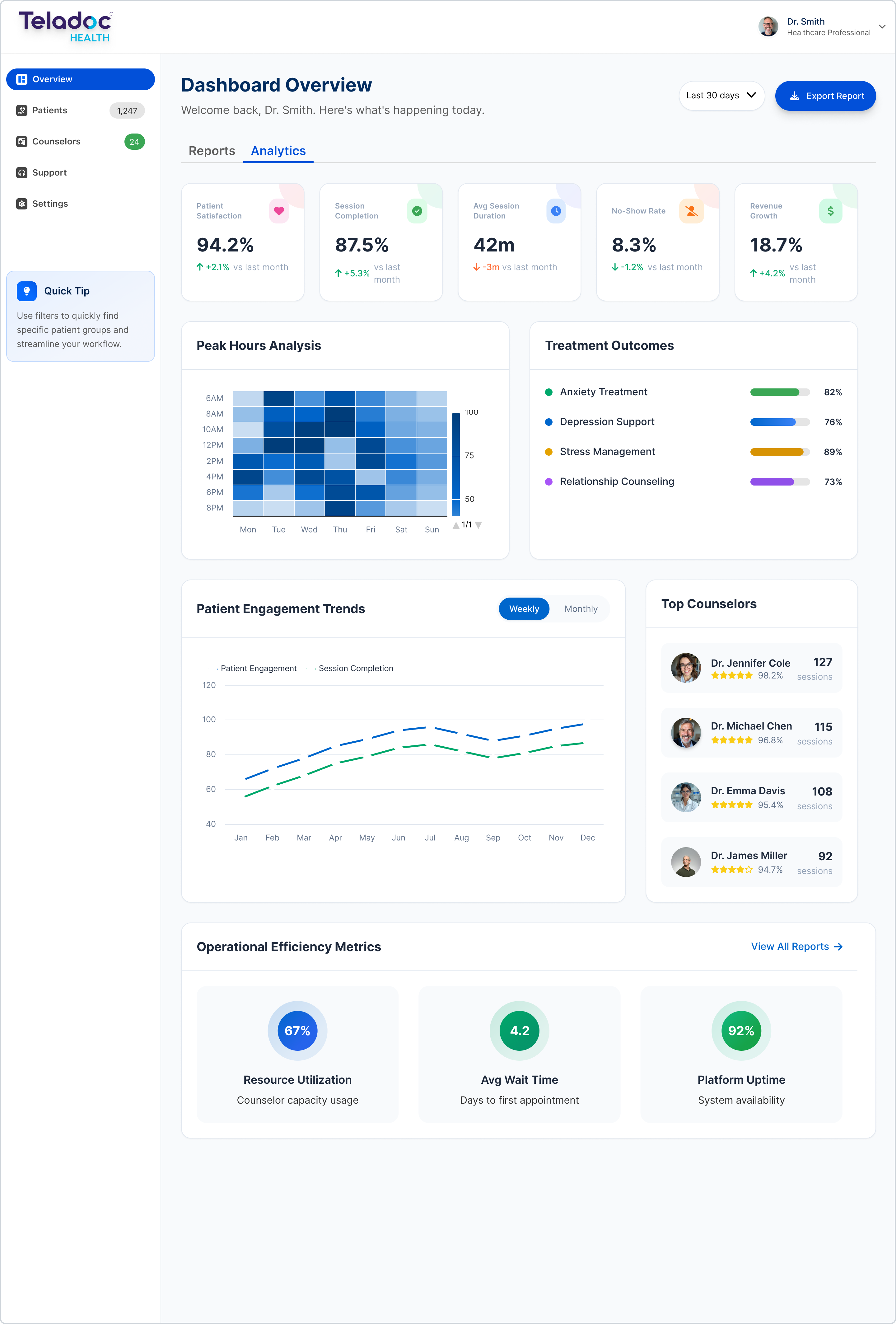
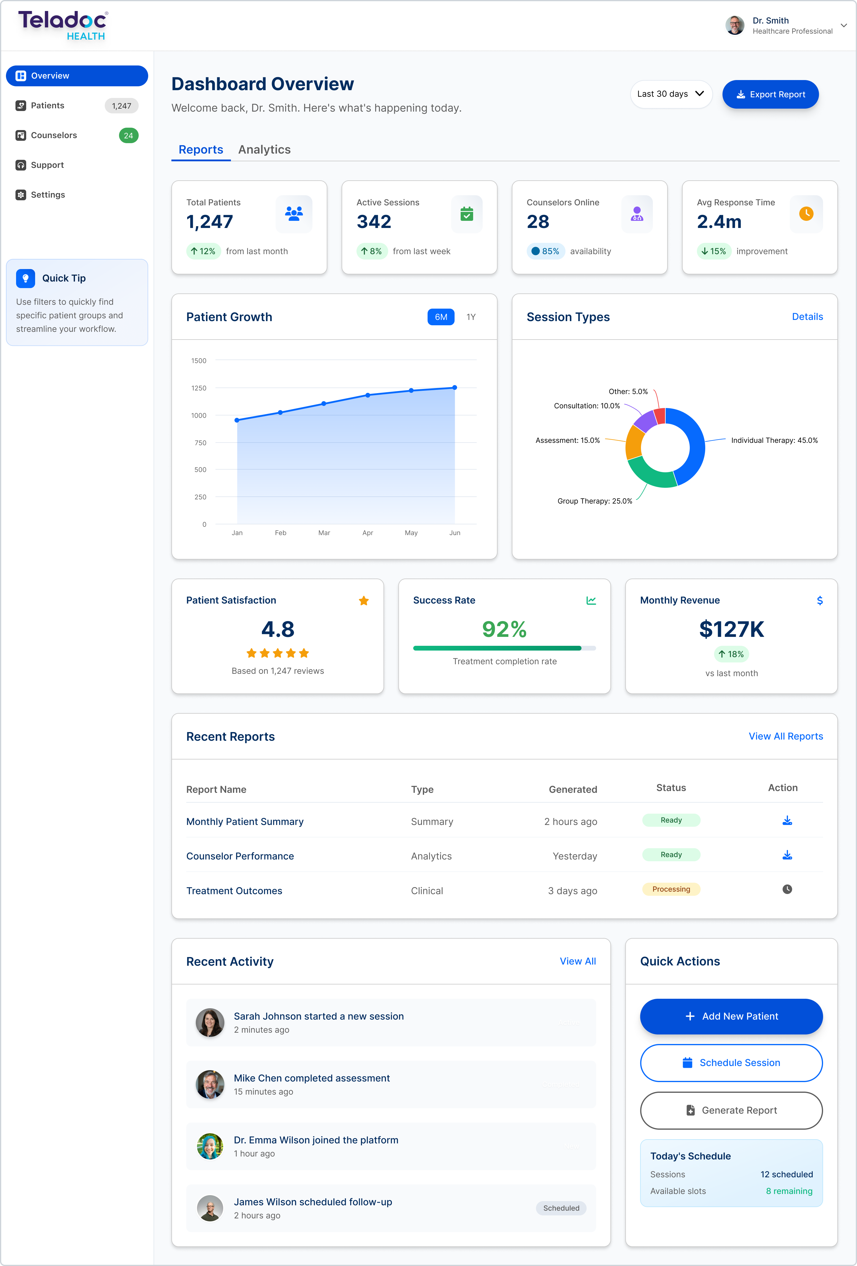
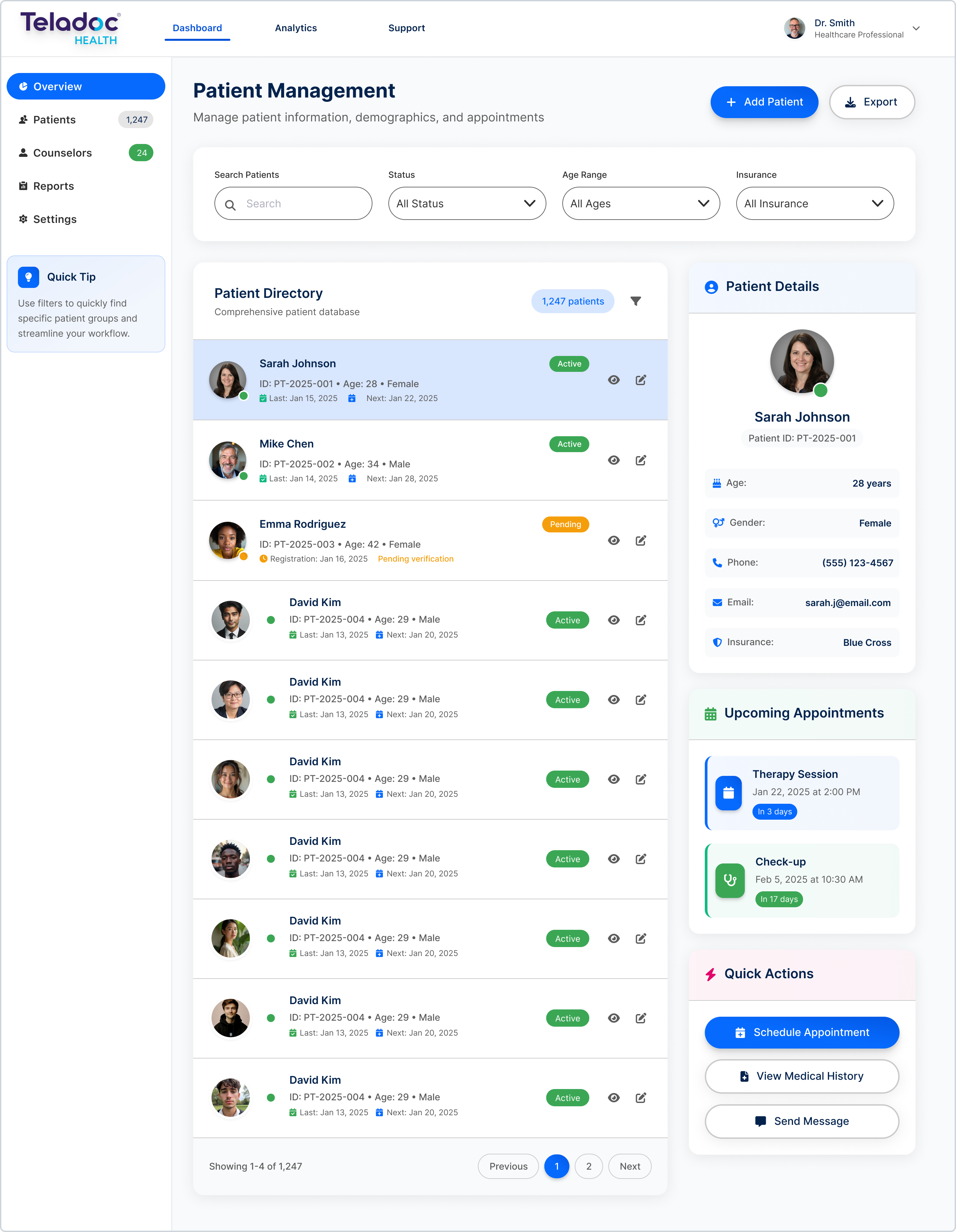
Teladoc Health required a scalable and consistent design foundation for its patient and provider platforms. The goal was to unify visual and functional consistency across products built with Salesforce Lightning Design System (SLDS). My role focused on defining the structure, logic, and visual integrity of the interface—ensuring accessibility compliance, performance efficiency, and component interoperability between Figma and SLDS v2.
Project Summary
Timeline & Team
3 months
Senior UX/UI Designer, Product Manager, Engineering Team
Tools & Methodology
Figma, Salesforce SLDS
Wireframing, design system integration, and component standardization
Key Deliverables
- • Modular UI Kit
- • Design tokens
- • Component library
- • Accessibility documentation
Performance Metrics
Design consistency across all SLDS-integrated modules
(validated during QA and development)
Faster handoff between design and development
(measured by Jira sprint velocity)
Reduction in accessibility-related QA issues
(after implementing SLDS-compliant tokens)
Problem Statement
Challenge
Create a unified and scalable UI Kit that could support multiple product lines under Teladoc Health's ecosystem while adhering to Salesforce Lightning Design System (SLDS) standards. The system needed to maintain accessibility compliance, enable faster design-to-development workflows, and remain flexible for future integrations.
Approach
Following a design system–driven methodology, I structured the process around:
- Audit: Analyzed legacy UI patterns, visual inconsistencies, and overlapping components.
- Wireframing: Defined new information hierarchy and layout structures to improve clarity and reduce cognitive load.
- Design Integration: Translated wireframes into high-fidelity mockups using SLDS components, ensuring alignment with Salesforce design tokens.
- Documentation: Built a living design reference for designers and developers to maintain component consistency.
- Validation: Conducted QA sessions with engineers to confirm behavior alignment with Lightning component standards.
Solution
Developed a modular UI Kit that streamlined the creation of patient and provider interfaces. The kit included Lightning-based component templates, adaptive grid systems, and tokenized visual styles. Accessibility standards were embedded into every component, ensuring WCAG 2.1 compliance and faster scalability for future features.
Deliverables included a complete Figma library, design documentation, and integration guidelines for the engineering team.
Results
The project unified Teladoc Health's visual language across multiple digital products, improving scalability and cross-platform consistency.
It strengthened alignment between design and engineering through shared Lightning tokens and documented component standards, reducing redundant UI creation by 45% and lowering maintenance costs.
The new system also enhanced accessibility compliance and improved long-term design governance through structured documentation and pattern validation.
Key Takeaway
A strong design system doesn't only enhance consistency—it accelerates innovation. By embedding accessibility, modularity, and cross-platform scalability into the core of the UI Kit, this project transformed Teladoc's design workflow into a cohesive, Lightning-driven ecosystem.